Every day, we encounter countless logos—whether on billboards, websites, or product packaging. Some logos appear straightforward, but many contain hidden meanings or subtle details that add layers of depth. These carefully crafted designs often go unnoticed, but they carry stories that help make the brand unforgettable. Today, we’re diving into the fascinating world of logo design to uncover the hidden messages and stories behind some of the most iconic logos around the globe.

1. Tesla: A “T” That Speaks Volumes
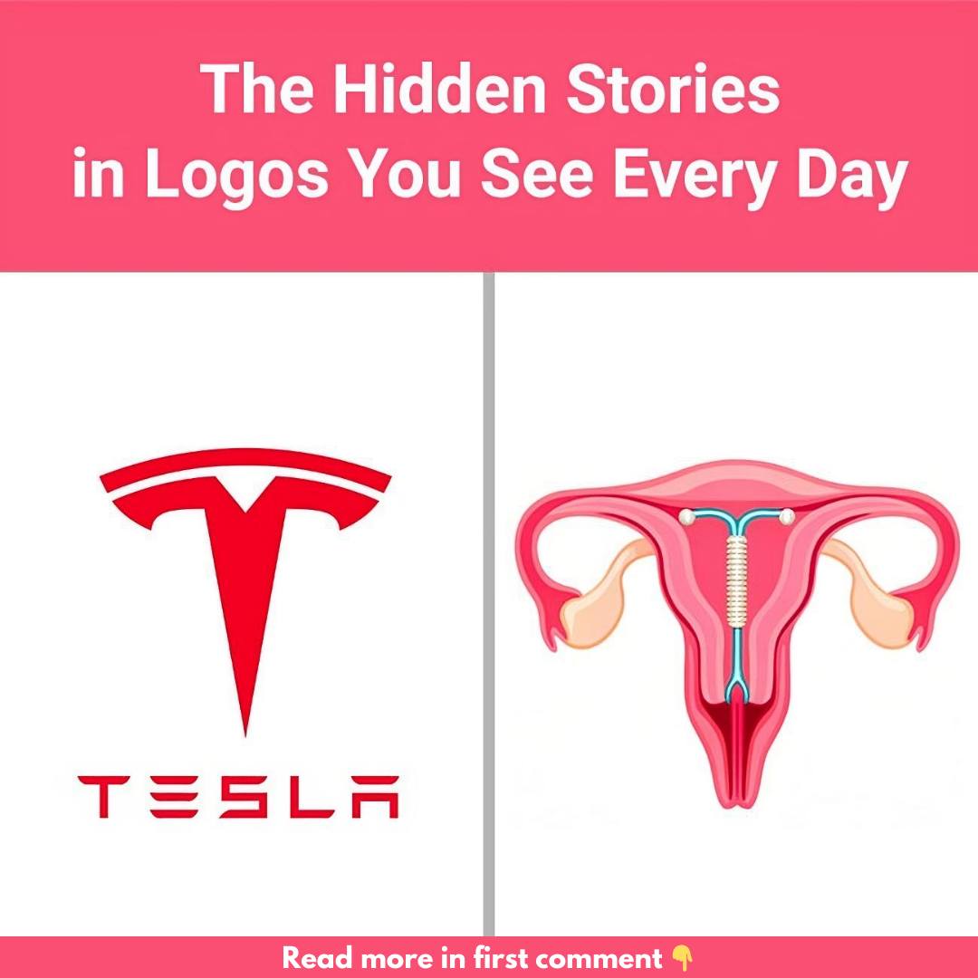
At first glance, Tesla’s logo seems like a sleek and modern “T” to represent the company’s name. However, upon closer inspection, it becomes clear that this logo holds more meaning. While some say it resembles a cat’s nose or an IUD, the most accepted interpretation is that the Tesla “T” symbolizes a cross-section of an electric motor. This design perfectly ties into the company’s innovative electric vehicle technology, making the logo more than just a stylish letter—it’s a nod to their groundbreaking engineering.
2. Uncle Ben’s: A Familiar Face with History
Uncle Ben’s, a popular brand known for its rice, features a familiar and friendly face on its packaging. That gentleman is said to be modeled after Frank Brown, a maître d’hôtel from Chicago whom the founders met in the 1940s. His warm and inviting presence left a lasting impression, inspiring the brand to use his likeness to embody qualities like trust, warmth, and reliability in every box.
3. Amazon: More Than Just a Smile
Amazon’s logo is deceptively simple but packed with meaning. Most people see the smile and arrow pointing from “A” to “Z,” symbolizing customer satisfaction. However, that arrow also represents Amazon’s promise of offering everything under the sun, from A to Z. It’s a perfect example of how a minimalist design can still convey a wealth of information about a company’s goals.
4. Hershey’s Kisses: A Sweet Hidden Detail
If you’ve ever looked closely at the Hershey’s Kisses logo, you might have noticed a tiny hidden surprise. Between the “K” and the “I” in the word “Kisses,” there’s a small Hershey’s Kiss tucked away in the negative space. This delightful detail adds a playful twist to the logo and reinforces the product’s charm and sweetness, giving fans something extra to smile about.
5. Quiksilver: Riding the Great Wave
Quiksilver, a popular surf brand, features a logo that combines a dynamic wave and a mountain. This design is inspired by Hokusai’s famous Japanese woodblock print, The Great Wave off Kanagawa. The logo perfectly captures the adventurous and nature-connected spirit that defines the brand, making it a go-to for surfers and outdoor enthusiasts alike.
6. Versace: The Alluring Power of Medusa
Versace’s logo, featuring Medusa from Greek mythology, wasn’t chosen at random. Gianni Versace selected Medusa for her ability to captivate anyone who gazed upon her. By using Medusa as the brand’s symbol, Versace aimed to evoke that same magnetic attraction with his fashion designs—people would be enchanted and unable to look away.
7. Disney: A Real-Life Castle
Disney’s fairytale castle logo is instantly recognizable, evoking magic and childhood wonder. But few people know that this iconic castle is modeled after the Neuschwanstein Castle in Germany. Built by King Ludwig II, this enchanting structure reflects the whimsical worlds Disney brings to life through its films, adding an element of real-world history to the fantasy.
8. The Laughing Cow: An Infinite Loop of Fun
The Laughing Cow logo is more than just a cheerful cow—there’s a clever design trick known as the Droste effect at play. The cow’s earrings show a mini version of the logo, creating a repeating image within an image. This playful touch mirrors the brand’s lighthearted personality and keeps the smiling cow fresh in consumers’ minds.
9. NASA’s Meatball: A Symbol of Space Exploration
NASA’s famous “meatball” logo, designed in 1959, contains several symbolic elements. The blue circle represents Earth, while the stars signify space. The red chevron symbolizes a wing, a nod to NASA’s aeronautical roots, and the orbiting spacecraft highlights the agency’s mission in space exploration. Every element of this logo tells the story of NASA’s ambitions and achievements.
10. LUKOIL: Honoring Its Roots
LUKOIL, one of Russia’s largest oil companies, hides a tribute in its name. The company’s name is an acronym of three oil-producing cities: Langepas, Uray, and Kogalym. By embedding these cities into the brand name, LUKOIL honors the places that helped fuel its success.
Conclusion: More Than Just a Logo
Logos are more than simple designs—they carry hidden stories, values, and visions that make brands unforgettable. The next time you look at a logo, take a closer look—you might just discover something new. These hidden details add depth and keep us thinking, proving that the best logos are those that continue to intrigue and inspire.


