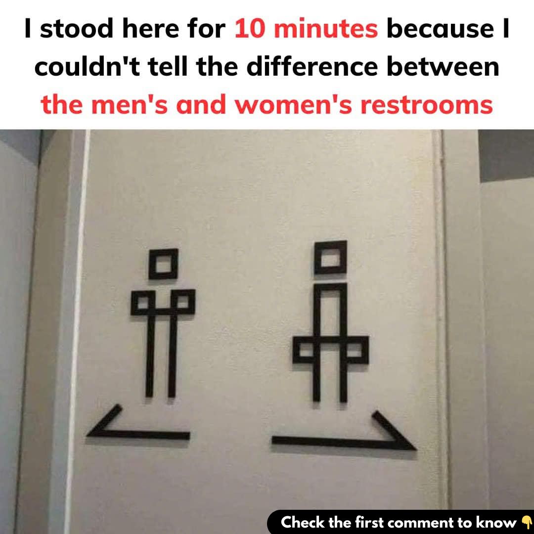
Imagine standing in a hallway, urgently needing a restroom, but frozen in place because the signs on the doors are so ambiguous that you can’t tell which is which. If this situation sounds familiar, you’re not alone. Many people have found themselves stuck, trying to decode restroom signs that should be simple and straightforward but are instead overly complicated and confusing.

Why has something as basic as identifying restrooms become such a challenge? The answer lies in a mix of creativity, cultural differences, and design choices that prioritize aesthetics over functionality. Let’s explore why restroom signs often go wrong and how we can improve them to serve their purpose better.
Why Do Restroom Signs Get So Complicated?
The primary job of a restroom sign is to clearly indicate which facility is for men and which is for women. However, many public spaces have overcomplicated this task by using abstract designs, humorous depictions, or culturally specific symbols. While these choices might reflect a business’s brand or aesthetic, they often leave users confused.
This issue often arises from a desire to stand out. Businesses and institutions aim to showcase creativity or align the signs with their overall theme, but in doing so, they sometimes sacrifice clarity. The result is signage that looks great but fails in its basic function—helping people find the restroom they need quickly and without stress.
What We Look for in Restroom Signs
When approaching a restroom, most people rely on quick, intuitive visual cues. Traditional signs usually include the following elements:
- Symbols or Silhouettes: Simple stick figures representing men and women are widely recognized.
- Clothing Cues: A dress for women and pants for men, though these are increasingly considered outdated and limiting.
- Text Labels: Clear words like “Men” or “Women” that eliminate any guesswork.
Problems arise when signs deviate too far from these conventions. Restroom signs that use artistic flair, cultural references, or ambiguous designs can confuse users, especially those unfamiliar with the local context. For example, caricatures, abstract shapes, or symbols tied to specific cultures might be clever but fail to communicate effectively.
The Rise of Gender-Neutral Restrooms
In recent years, the push for inclusivity has brought about an increase in gender-neutral restrooms. These facilities aim to be welcoming to everyone, regardless of gender identity. Signs for gender-neutral restrooms often use simple terms like “All-Gender” or universal icons such as a toilet.
While this shift is a positive step, it can also introduce uncertainty for those accustomed to traditional signage. People encountering new symbols or unfamiliar terms may hesitate, unsure if the facility meets their needs. Clear and straightforward designs are crucial to making gender-neutral restrooms accessible and intuitive for everyone.
Real-Life Examples of Confusing Restroom Signs
Some restroom signs have gained notoriety for their ambiguity. Consider these examples:
- Abstract Art: A figure with a triangle for one restroom and a circle for another might aim to represent gender symbols but lacks intuitive clarity.
- Humorous Depictions: Using animals like roosters and hens or bucks and does might seem funny but can be stressful for someone in a hurry.
- Minimalist Designs: Ambiguous silhouettes with only subtle differences, like the tilt of a head or the angle of a hat, can leave users guessing.
- Cultural Barriers: Symbols or words tied to specific cultural norms might not translate well for international visitors, leading to confusion.
How to Design Better Restroom Signs
To avoid confusion, restroom signs must prioritize clarity and inclusivity. Here are some guidelines for effective design:
- Use Universal Symbols: Stick to universally recognized stick figures or straightforward icons that are easy to interpret at a glance.
- Add Text Labels: Pair symbols with text like “Men,” “Women,” or “Restroom” to eliminate ambiguity for all users.
- Embrace Simplicity for Gender-Neutral Signs: For all-gender restrooms, use inclusive icons like a toilet or neutral terms such as “Restroom” to ensure clarity.
- Test Your Design: Before installing new signage, test it with a diverse group of people. If even one person hesitates, consider revising the design.
- Avoid Outdated Stereotypes: Move away from traditional cues like dresses for women or ties for men, which may feel exclusionary and fail to reflect modern gender diversity.
The Bigger Picture: Inclusivity and Accessibility
While confusing restroom signs might seem like a minor annoyance, they highlight broader issues of inclusivity and accessibility. For non-binary and transgender individuals, navigating public restrooms can already be a stressful experience. Clear, inclusive signage sends a message of respect and ensures that everyone feels welcome.
Conclusion: Small Changes, Big Impact
Ambiguous restroom signs may spark a moment of frustration, but they also represent a larger conversation about design, inclusivity, and respect. By prioritizing clarity over creativity, businesses and institutions can create spaces that are accessible to all. Clear signage not only serves a practical purpose but also reflects a commitment to making everyone feel comfortable and included.
As we move forward, let’s ensure that restroom signs serve their purpose effectively. Whether it’s a traditional or gender-neutral restroom, every user deserves an easy, stress-free experience. After all, no one should be stuck in confusion over something as basic as a restroom sign.


